매일 나는 내 분홍색 메모지 더미를 바라보며 내 모든 미해결 과제를 상기시킵니다 :-D. 하지만 오늘은 이 메모지 중 하나를 버릴 수 있을 것 같은 기분이 듭니다. "Jumping® 로고 사용에 대한 블로그 포스트"라고 적힌 그 메모지입니다.
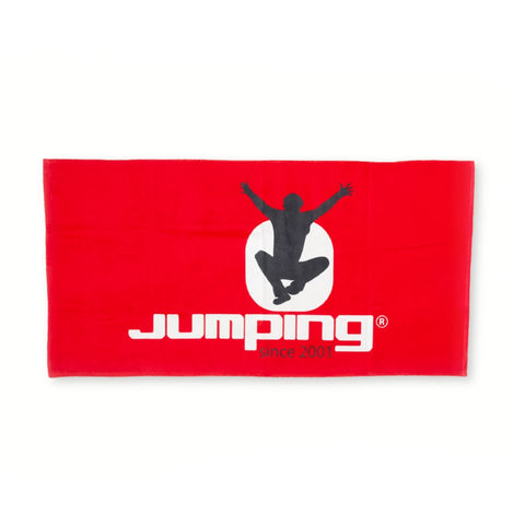
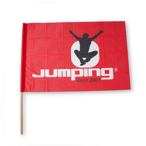
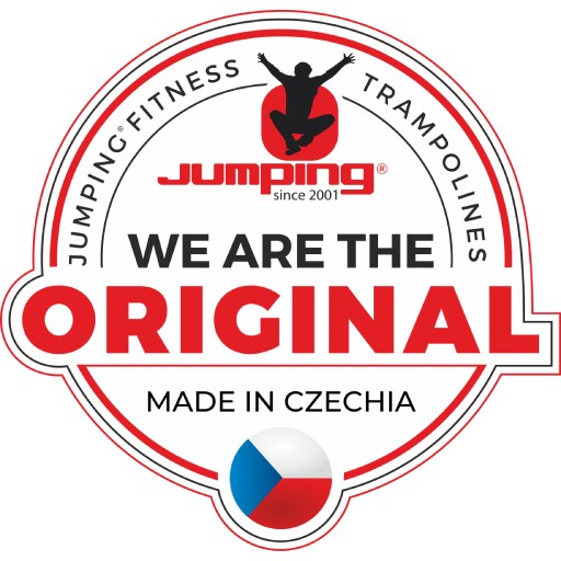
그래서 친절하고 넓게 시작하겠습니다. 여러분은 아마 Jumping® 로고를 알고 계실 것입니다 - "Jumping"이라는 단어 위에 원 안에 있는 그림이 있습니다. 이것은 제가 꽤 자주 듣는 것입니다. 하지만 사실, logo consists of the word Jumping and there is a DOT ABOVE THE LETTER “I” :-D. And the figure is inside this dot:-D. And that’s it :-)
I know that this is not the best logo design but it has been around for quite some time now, being registered nearly half around the world and having gained brand awareness within the fitness community. So we are definitely not going to change it.
Yes, your eyes are not deceiving you, the logo is registered which means that it is a trademark. Therefore, it is not completely kosher if you download the logo and print it as you like on different things which you sell then. We have been closing our eyes for a long time but enough is enough.
Look at it from the opposite perspective… Can you imagine downloading the “NIKE” logo, printing it on T-shirts and selling it happily???
I think or at least I hope that I would not have to wait for your answer too long:-D. Well, so you know what I mean. Boys and girls, please …
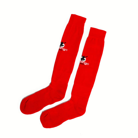
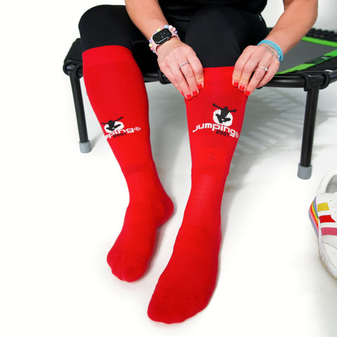
Just a side note: we have registered also the figure and even the dot with the figure :-*. This takes a lot of time, efforts and money. It takes a lot of nerve and aching feet as we beat a path for all those smart jumpers who “get inspired” by us to put it politely. So at least those of you who chose Jumping® which has been around since 2001, please respect this logo, do not “disassemble” it in any way, don’t move the dot over “M” or “P” :-D, don’t print the logo on clothing etc.
If you need or wish anything, please do not hesitate to write to me. We have always managed to sort things out together, haven’t we? :-)
Love, Jana :-*